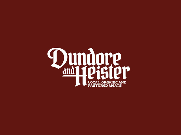
Dundore and Heister Pastured Meats
Design and branding for Dunmore and Heister - an artisanal butcher shop in Reading, PA
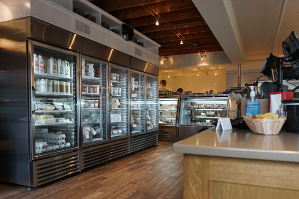
Long before ‘organic’ and ‘natural’ became trendy, Berks County embodied farm to table. Local butchers were a vital part of that way of life and were always considered trusted neighbors. Their shops offered a sense of community where customers felt welcome and they came to appreciate the skill and expertise of true craftsmen.
I was asked to create every aspect of the Dundore & Heister brand so it would pay tribute to the legacy of nose-to-tail thrift and honor the timeless tradition of connecting proud and hard-working farmers to their communities without pretense. The brand needed to stand in contrast to today’s sterile and faceless supermarket experience, connect wiith the legacy of Berk's County and portray that the brand would offer local, pasture-raised and organic meats in a unique, wholesome, and inviting environment reminiscent of a bygone era.

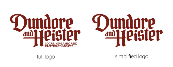
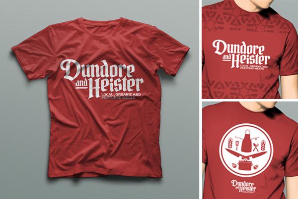
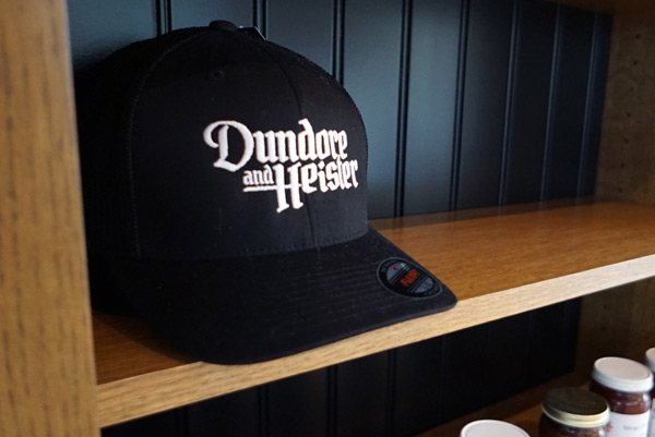
The typorgraphy of the logo needed to reference the Pennsylavnia Dutch traditions of Berks County without looking like the touristy characatures that fill that area. The logo was created using four different Old English, Germanic and Blackletter type faces which were then redrawn to create a unified look.

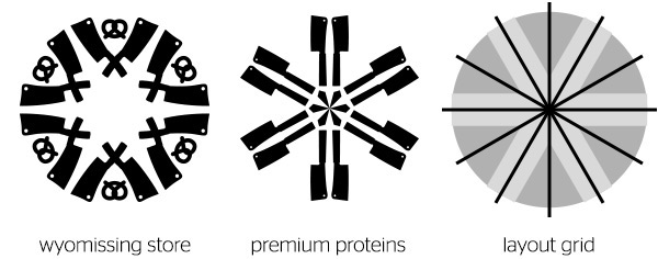
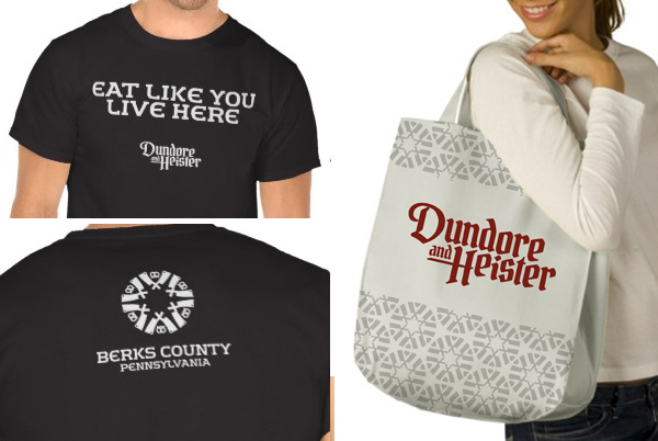
Hex symbols are an icon part of Pennsylvania Dutch traditions and we wanted to find a way to work them into the brands visual language. We have studied books, photography and scouted Berks County to figure out how to honor hex signs while finding ways to reinvent them for a modern brand. Some of the themes we have been working with are symmetry (most hex signs are 5 or 6 points) and mirrored images (represented strength and courage).
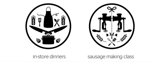
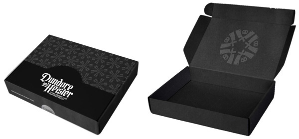
Dundore and Heister Hex symbols are created by choosing one of four different background shapes and combining them with a large set of design elements so the symbols can represent the brand, proteins, events or themes. The result are unqiue symbols that are a modern interpritation of the tradition Pennsylvania Dutch Hex symbol.

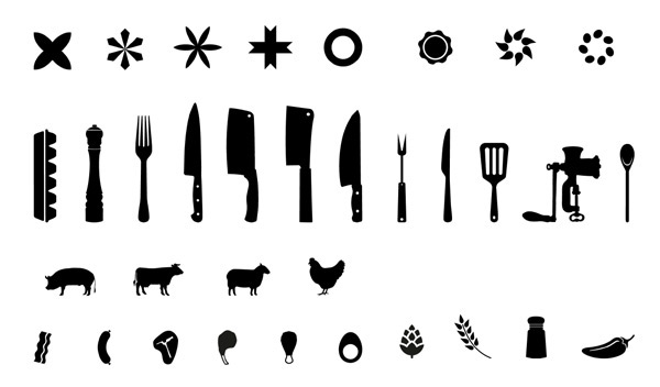
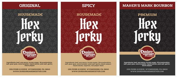
PROTEINS AND PRODUCTS
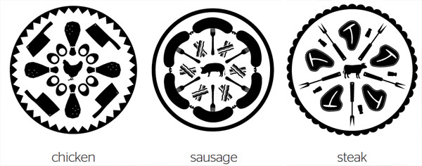
THEMATIC AND EVENTS

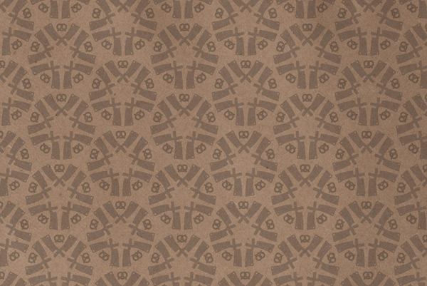
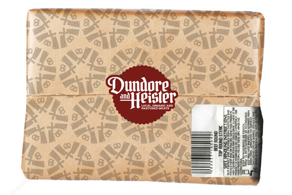
Hex symbols used as a pattern for the standard butcher paper

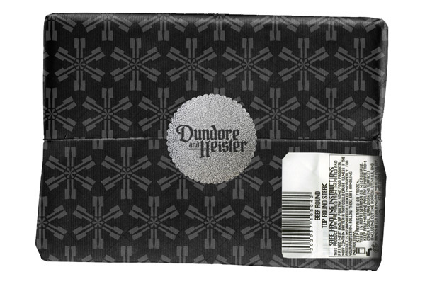
A simpler hex symbol used a pattern pattern on the premium butcher paper which is black butcher paper with the pattern printed in silver ink.
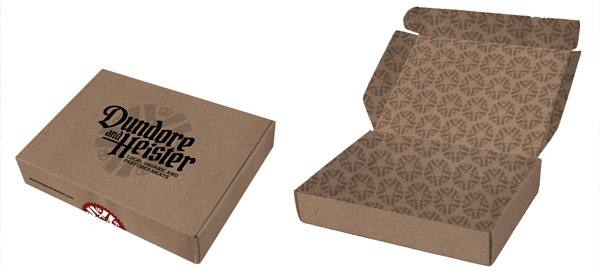
In-store product packaging designs
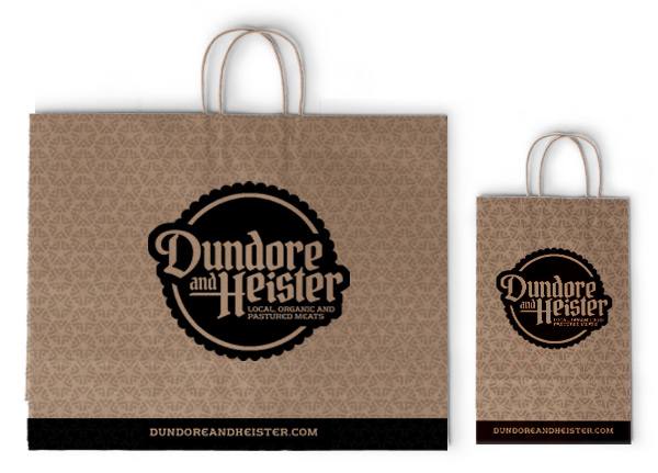
Brown paper shopping bags
Gift cards
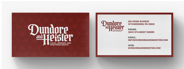
Business cards

STANDARD PACKAGING
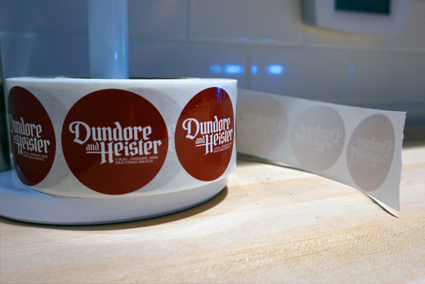
We wanted to create a heirarchy in the packaging in the store to help reinforce the price point and work that goes into creating dry-aged meat. The standard packaging used brwon kraft butcher paper that is printed with the hex symbol that has been created for each store location. The paper is then closed with a simple red logo sticker.
PREMIUM PACKAGING
Premium packaging was created to reinforce the price point and work that goes into creating dry aged meats so that when a customers buys this meat it feels more premium and other customers are aware that their purchse is special. The premium feel was created by using black kraft butcher paper printed with silver ink and sealed with a silver foil sticker.

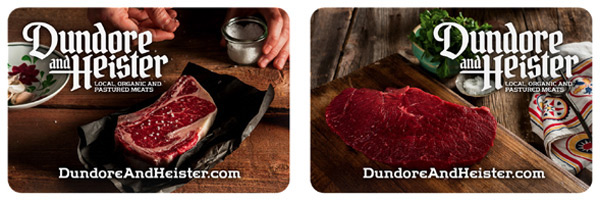
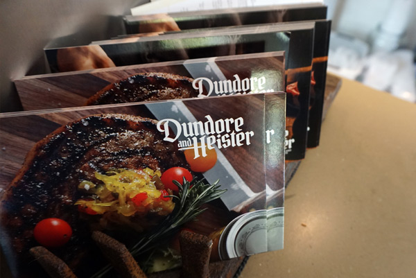
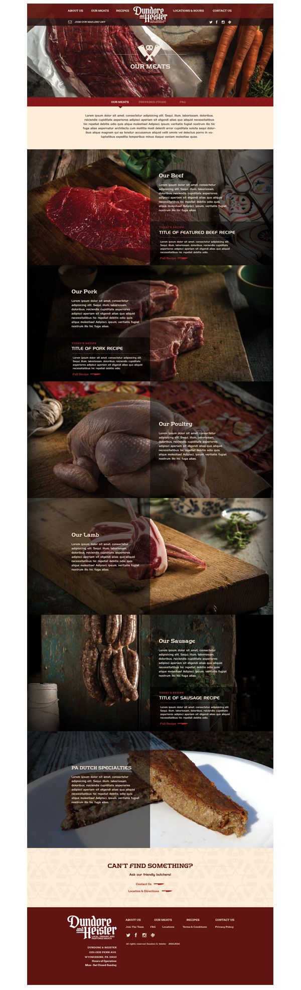
The brand phototgraphy was shot with a style that romanticed the meat, used props from Berks County to give it a sense of place and used a natural color palette to reinforce the natural philosophy of the brand.
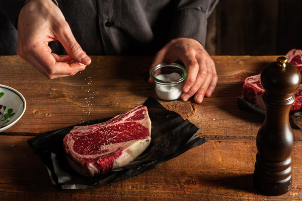
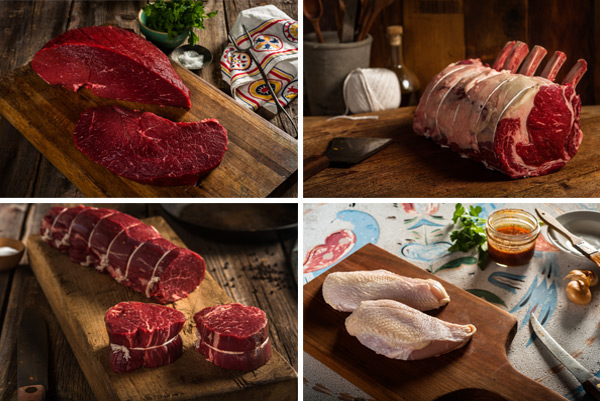
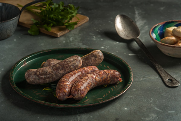
Brand photography shoy by Jennifer May


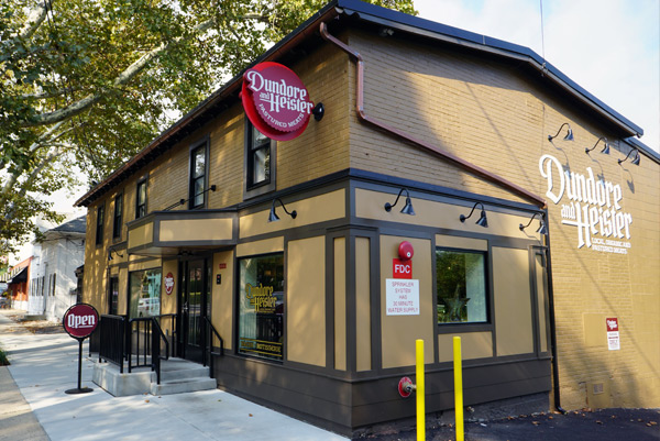
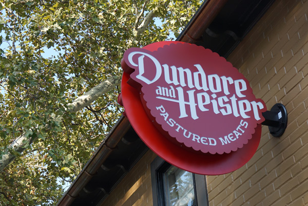
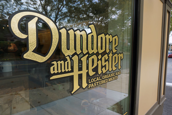
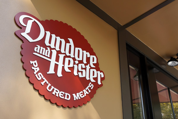
I was asked to design all exterior signage and retail window branding then oversaw their creation with the architect and signage company. Exterior signage consisted of primary illuminated round sign, wall mural, gold leaf retail windows and free standing 'Open' sign.
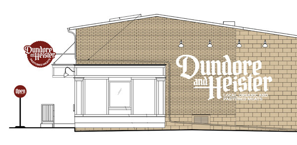
Original store elevation drawing
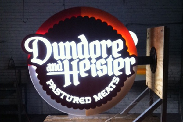
Primary exterior sign illumination and background color readability test

Web site designed and developed with EMN Partners